When it comes to enhancing the user experience on your website or web application, pop-up dialogs can be a powerful tool. They allow you to display additional information, forms, or alerts without redirecting the user to a new page.
Bootstrap, one of the most popular front-end frameworks, offers a built-in component called Modals that simplifies the process of creating and displaying pop-up dialogs. These dialogs are versatile and can serve various purposes, such as:
Collecting user input through forms.
Displaying detailed information.
Confirming actions (e.g., “Are you sure you want to delete this item?”).
Before diving into modal creation, ensure you have Bootstrap integrated into your project. You can do this by including the Bootstrap CSS and JavaScript files, either by downloading them and hosting them locally or by linking to the Bootstrap content hosted on a content delivery network (CDN).
<!-- Latest compiled and minified CSS -->
<link rel="stylesheet" href="https://maxcdn.bootstrapcdn.com/bootstrap/3.4.1/css/bootstrap.min.css">

<!-- jQuery library -->
<script src="https://ajax.googleapis.com/ajax/libs/jquery/3.6.4/jquery.min.js"></script>

<!-- Latest compiled JavaScript -->
<script src="https://maxcdn.bootstrapcdn.com/bootstrap/3.4.1/js/bootstrap.min.js"></script>
Let’s create a basic example of a Bootstrap Modal:
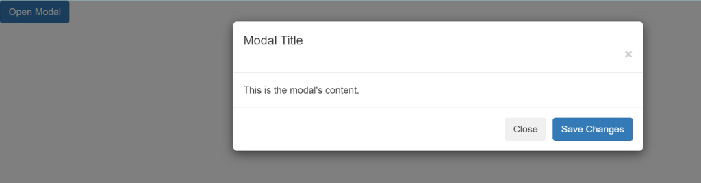
<!-- Button to trigger the modal -->
<button type="button" class="btn btn-primary" data-toggle="modal" data-target="#myModal">
Open Modal
</button>
<!-- The Modal -->
<div class="modal" id="myModal">
<div class="modal-dialog">
<div class="modal-content">
<!-- Modal Header -->
<div class="modal-header">
<h4 class="modal-title">Modal Title</h4>
<button type="button" class="close" data-dismiss="modal">×</button>
</div>
<!-- Modal body -->
<div class="modal-body">
This is the modal's content.
</div>
<!-- Modal footer -->
<div class="modal-footer">
<button type="button" class="btn btn-secondary" data-dismiss="modal">Close</button>
<button type="button" class="btn btn-primary">Save Changes</button>
</div>
</div>
</div>
</div>
We have a button with the attribute data-toggle="modal" and data-target="#myModal". This button triggers the modal when clicked.
The modal itself is defined inside a div with the class="modal" and id="myModal". The id matches the data-target of the button.
The modal content includes a header, body, and footer sections.
There are buttons in the footer that allow the user to close the modal or perform some action.
Bootstrap Modals offer a wide range of customization options. You can:
- Change the modal size (small, large).
- Add forms for user input.
- Include images, videos, or any HTML content.
- Customize the appearance using Bootstrap classes.
Bootstrap Modals are a fantastic tool for creating user-friendly pop-up dialogs in your web projects. They are easy to implement and highly customizable, making them suitable for various use cases. By incorporating Bootstrap Modals, you can provide a seamless and engaging user experience on your website or web application.