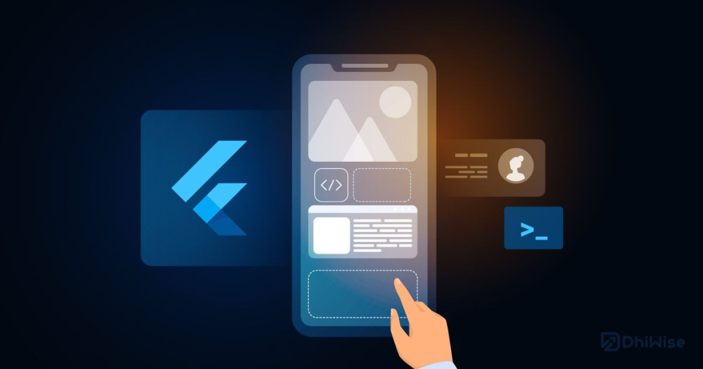
Flutter, Google’s UI toolkit for building natively compiled applications for mobile, web, and desktop from a single codebase, has revolutionized the way developers create user interfaces. At the heart of Flutter lies the concept of widgets, the fundamental building blocks that compose every element of the user interface.
In Flutter, everything is a widget – from structural elements like buttons and text to layout components like rows and columns. Widgets are immutable, declarative UI elements that define the layout, appearance, and behavior of your application’s user interface.
The Role of Widgets in Flutter:
Widgets serve several crucial functions in Flutter development:
- UI Construction: Widgets provide the foundation for constructing the user interface of your application, allowing you to arrange and customize visual elements with ease.
- Composition: Widgets can be composed hierarchically to create complex UI layouts, enabling developers to build sophisticated interfaces from simple building blocks.
- Interactivity: Widgets encapsulate interactive elements such as buttons, text fields, and gestures, enabling users to interact with the application and trigger actions.
- State Management: Widgets can manage their own state, allowing for dynamic updates and responsiveness in the user interface based on user input or application logic.
Importance of Widgets in Flutter:
Widgets are integral to Flutter’s philosophy of creating beautiful, fast, and expressive user experiences. They offer the following benefits:
- Consistency: Widgets promote consistency in UI design and behavior across different platforms, ensuring a seamless user experience.
- Reusability: Widgets are highly reusable, allowing developers to encapsulate UI components and reuse them across different parts of the application or even in multiple projects.
- Performance: Flutter’s reactive framework and efficient rendering engine optimize the performance of widgets, resulting in smooth and responsive user interfaces.
Using Widgets in Flutter:
To use widgets in Flutter, you simply import the necessary libraries and instantiate the desired widgets within the widget tree. Widgets are organized in a hierarchical structure, with each widget representing a node in the tree.
import 'package:flutter/material.dart';

void main() {
  runApp(MyApp());
}

class MyApp extends StatelessWidget {
  @override
  Widget build(BuildContext context) {
    return MaterialApp(
      home: Scaffold(
        appBar: AppBar(
          title: Text('Flutter Widgets'),
        ),
        body: Center(
          child: Text('Hello, World!'),
        ),
      ),
    );
  }
}
In this example, MyApp is a stateless widget that returns a MaterialApp widget, which in turn contains a Scaffold widget with an AppBar and a Center widget containing a Text widget.
Types of Widgets in Flutter:
Widgets in Flutter can be broadly categorized into two types:
- Stateless Widgets: Stateless widgets are immutable and do not maintain any internal state. They are ideal for representing UI elements that do not change over time, such as static text or icons.
- Stateful Widgets: Stateful widgets are mutable and can maintain internal state that changes over time. They are used for UI elements that require dynamic updates or user interaction, such as forms or animations.
Important Widgets in Flutter:
While Flutter provides a vast array of widgets for building diverse user interfaces, some of the most commonly used widgets include:
Text: Displays a string of text.
Image: Displays an image from various sources.
Container: A versatile widget for styling and positioning other widgets.
Row and Column: Arranges widgets in horizontal or vertical layouts, respectively.
ListView and GridView: Display lists or grids of widgets, respectively, with scrolling capabilities.
TextField and Button: Input and interactive elements for capturing user input and triggering actions.