MOTOSHARE 🚗🏍️
Turning Idle Vehicles into Shared Rides & Earnings

From Idle to Income. From Parked to Purpose.
Earn by Sharing, Ride by Renting.
Where Owners Earn, Riders Move.
Owners Earn. Riders Move. Motoshare Connects.

With Motoshare, every parked vehicle finds a purpose. Owners earn. Renters ride.
🚀 Everyone wins.

Start Your Journey with Motoshare

How to make Flutter Alert Dialog box

Alert dialog boxes are a common way to display important information to users in mobile apps. Flutter provides a simple and easy way to create alert dialog boxes.

Creating an alert dialog box

To create an alert dialog box in Flutter, you can use the AlertDialog widget. The AlertDialog widget takes a number of parameters, including:

  • title: The title of the alert dialog box.
  • content: The content of the alert dialog box.
  • actions: A list of buttons that can be displayed at the bottom of the alert dialog box.

Example

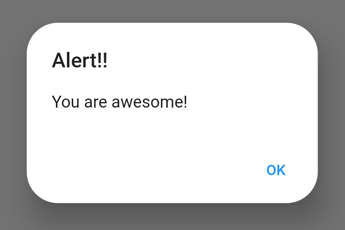
The following code shows how to create a simple alert dialog box:

import 'package:flutter/material.dart';

void main() {
  runApp(MyApp());
}

class MyApp extends StatelessWidget {
  @override
  Widget build(BuildContext context) {
    return MaterialApp(
      home: Scaffold(
        body: Center(
          child: TextButton(
            onPressed: () {
              showDialog(
                context: context,
                builder: (context) => AlertDialog(
                  title: Text('Alert Dialog Title'),
                  content: Text('Alert Dialog Content'),
                  actions: [
                    TextButton(
                      onPressed: () {
                        Navigator.of(context).pop();
                      },
                      child: Text('Close'),
                    ),
                  ],
                ),
              );
            },
            child: Text('Show Alert Dialog'),
          ),
        ),
      ),
    );
  }
}

When the user taps the “Show Alert Dialog” button, an alert dialog box will be displayed with the title “Alert Dialog Title” and the content “Alert Dialog Content”. The alert dialog box will also have a single close button.

Customizing an alert dialog box

You can customize the appearance and behavior of an alert dialog box by passing additional parameters to the AlertDialog widget. For example, you can:

  • Set the background color of the alert dialog box.
  • Set the elevation of the alert dialog box.
  • Set the shape of the alert dialog box.
  • Add additional buttons to the alert dialog box.

Example

The following code shows how to customize an alert dialog box:

import 'package:flutter/material.dart';

void main() {
  runApp(MyApp());
}

class MyApp extends StatelessWidget {
  @override
  Widget build(BuildContext context) {
    return MaterialApp(
      home: Scaffold(
        body: Center(
          child: TextButton(
            onPressed: () {
              showDialog(
                context: context,
                builder: (context) => AlertDialog(
                  title: Text('Alert Dialog Title'),
                  content: Text('Alert Dialog Content'),
                  backgroundColor: Colors.blue,
                  elevation: 20,
                  shape: RoundedRectangleBorder(
                    borderRadius: BorderRadius.circular(10),
                  ),
                  actions: [
                    TextButton(
                      onPressed: () {
                        Navigator.of(context).pop();
                      },
                      child: Text('Close'),
                    ),
                    TextButton(
                      onPressed: () {
                        // Do something else
                      },
                      child: Text('Cancel'),
                    ),
                  ],
                ),
              );
            },
            child: Text('Show Alert Dialog'),
          ),
        ),
      ),
    );
  }
}

This code will create an alert dialog box with a blue background, a 20 pixel elevation, and rounded corners. The alert dialog box will also have two buttons: a close button and a cancel button.

Related Posts

A Professional Path to Certified DevSecOps Engineer

The way software is built has changed forever. In the past, security was a final gate that code had to pass through before going live. Today, that…

The Guide to Certified DevSecOps Architect Certification

In today’s world, software is the heart of every business. But speed without safety is a risk no one can afford. For many years, we treated security…

Master Observability Engineering (MOE) : A Step-by-Step Career Guide

The landscape of software development has shifted beneath our feet. A decade ago, we could manage a handful of servers with simple scripts. Today, we are dealing…

A Comprehensive Guide to HashiCorp Terraform Training

Hashicorp Terraform is a tool that allows people to manage infrastructure using code. Instead of clicking buttons in a cloud console, engineers write files that describe what…

Complete Guide to Kubernetes Security for Professionals

In the modern era of software delivery, the “perimeter” has vanished. We no longer just protect a data center; we protect a dynamic, fluid environment of containers…

The Complete Certified Kubernetes Application Developer Manual for Modern Engineers

In the current era of software delivery, the wall between writing code and running it has crumbled. For a long time, developers focused only on logic, while…

0 0 votes
Article Rating
Subscribe
Notify of
guest
0 Comments
Oldest
Newest Most Voted
Inline Feedbacks
View all comments
0
Would love your thoughts, please comment.x
()
x